

ПРО ПРОЕКТ/
ABOUT THE PROJECT
ABOUT THE PROJECT
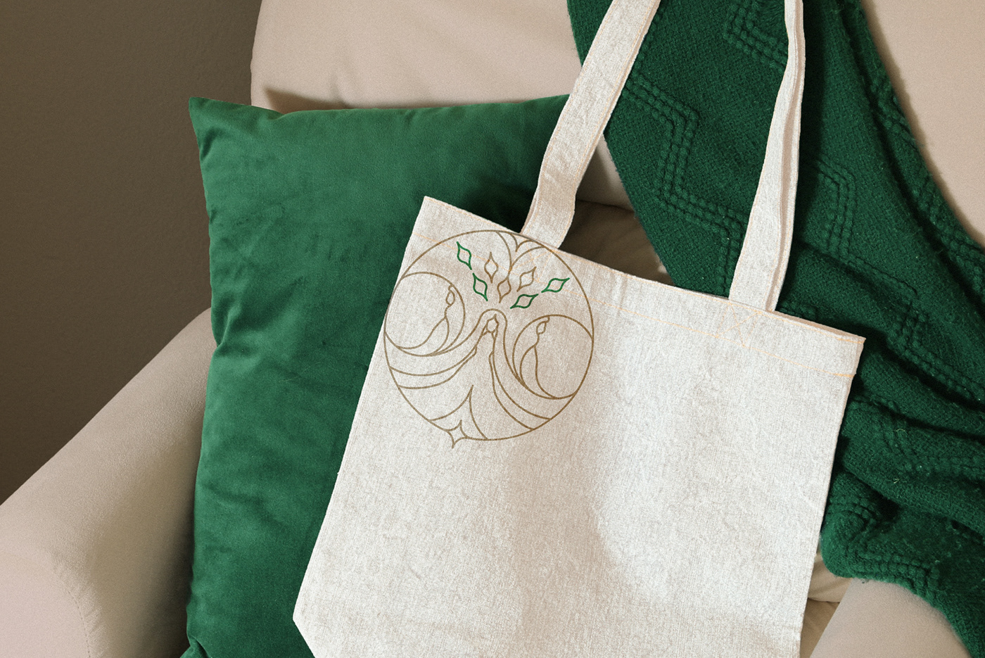
THREE NORNS PRESS є виробником якісних журналів, щоденників, листівок та інших канцтоварів для дітей та дорослих. Назва бренду пов’язана з міфом про Норн. Три Норни були мудрими жінками-прядильницями, які визначали долі людей і богів. Хоча вони не були ні доброзичливими, ні злими, їх боялися і шанували за їхню силу. Для бренду необхідно було створити логотип, який містить образи цих Норн. Отже, я створила логотип-емблему, на якому зображені три Норни. Вони зображені під деревом, листки якого показані у вигляді пера. Логотип має дві версії — круглу та у формі арки. Кругла версія добре підійте для круглих носіїв (фото профіля, наклейки). Логотип у формі арки створений для розміщення на зворотах листівок та щоденників.
THREE NORNS PRESS is a producer of high-quality journals, diaries, postcards and other stationery for children and adults. The name of the brand is related to the Norns myth. The three Norns were wise women weavers who determined the destinies of men and gods. Although they were neither benevolent nor evil, they were feared and revered for their power. For the brand, it was necessary to create a logo that contains images of these Norns. So, I created a logo-emblem, which shows the three Norns. They are depicted under a tree, the leaves of which are shown in the form of a pen. The logo has two versions — round and arched. The round version is well suited for round media (profile photos, stickers). The arch logo is designed to be placed on the back of the postcards and diaries, journals.


